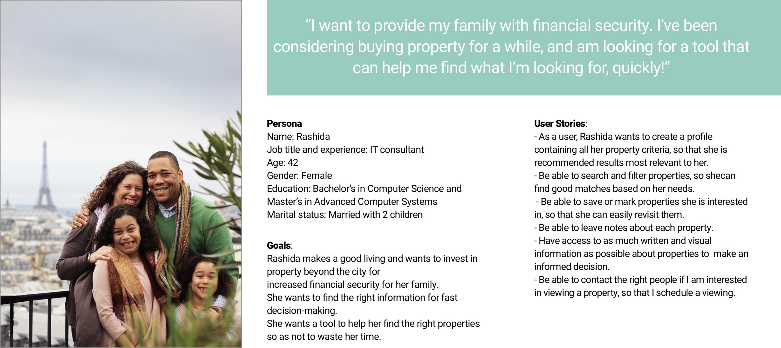
The 5 Ws
Who : This web app is made primarily for new, small-scale property buyers who are looking to invest for additional income or financial security.
What : This will be a user-friendly, responsive web app containing a database of available residential properties and land, and comprehensive information on each listing.
When : Buyers will use this tool when conducting property searches, and making a decision about where to invest.
Where : Buyers will use this tool at home or on the go. Users can search for properties anywhere, as long as they’re logged in on a device.
Why : Unseasoned buyers need access to reliable, uncomplicated information about their potential property investments. Buyers get a feel for a place by viewing comprehensive
information about the property and its neighborhood before spending time on-site.
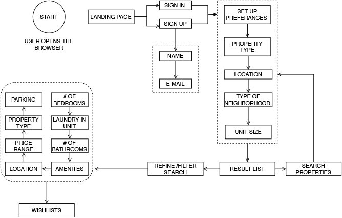
User Flow
Based on the key objective of the persona and user stories, I designed the tasks flow for achieving the users' goals.
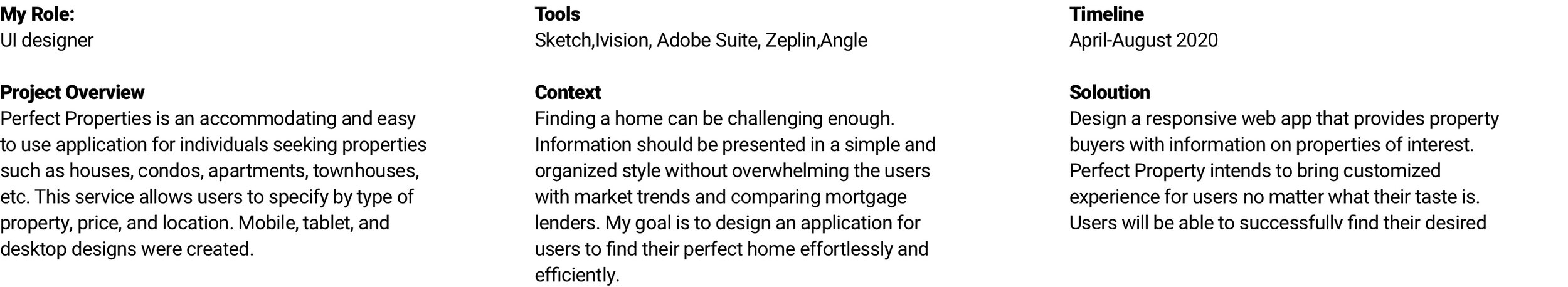
Design Process
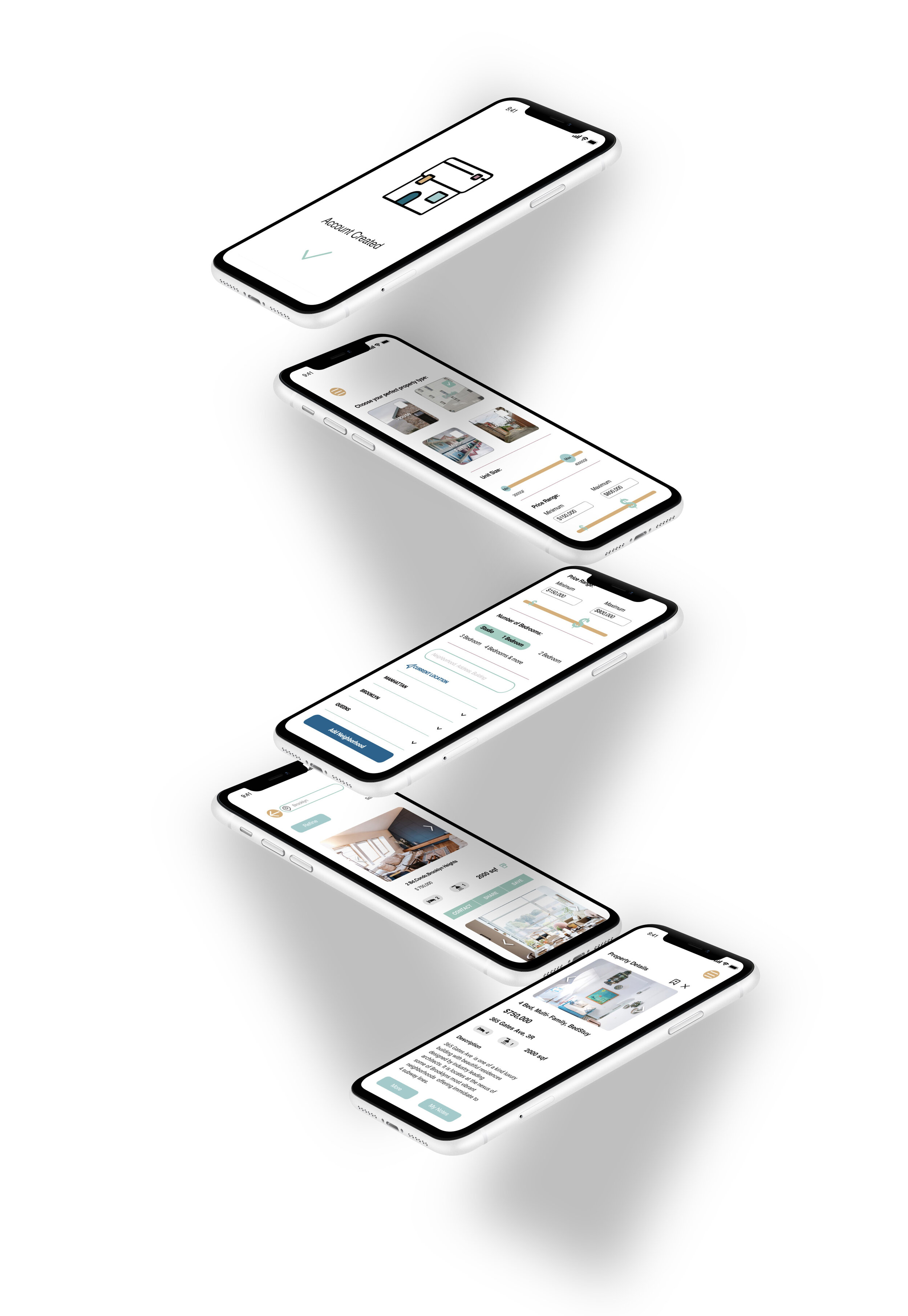
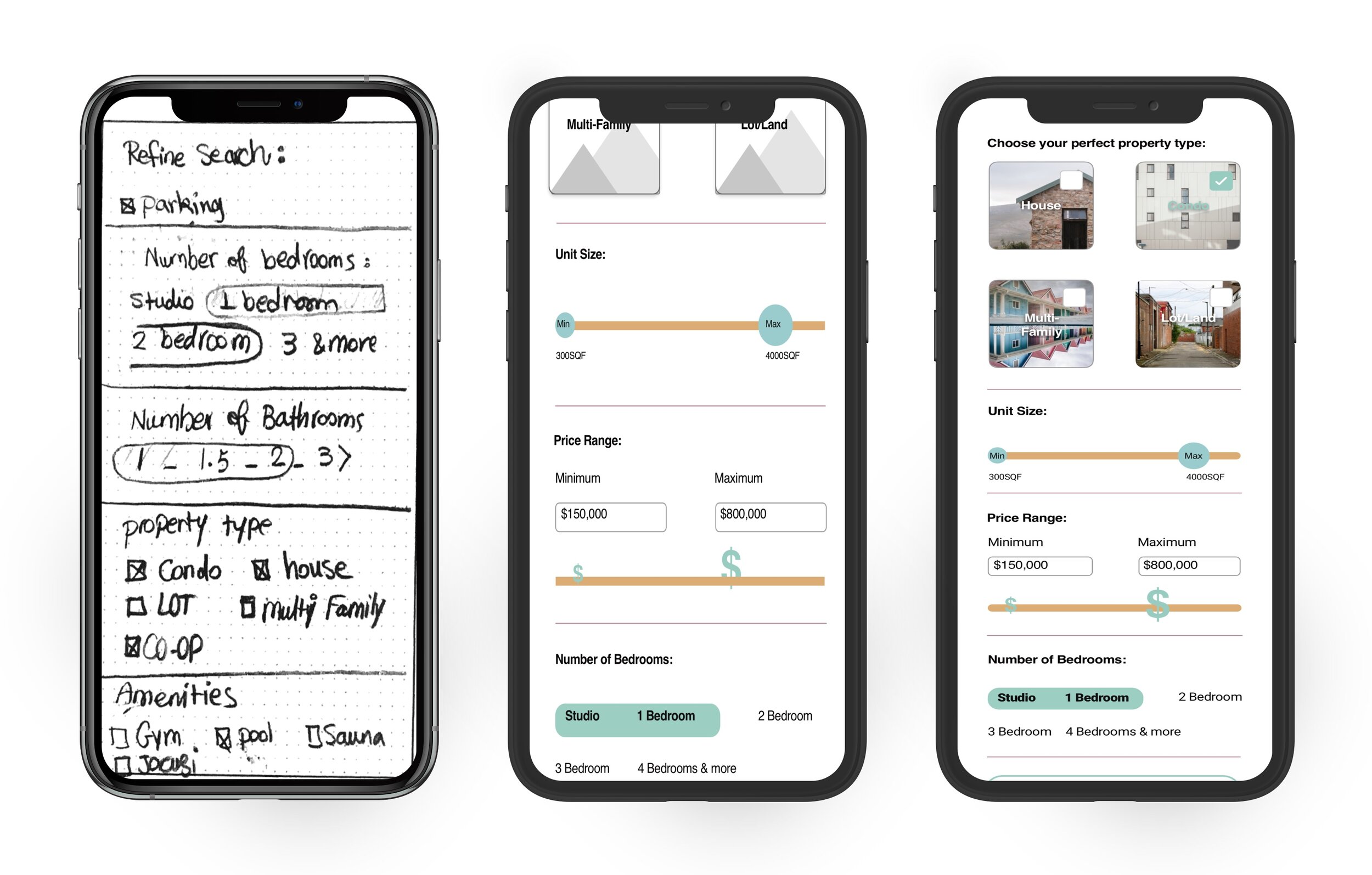
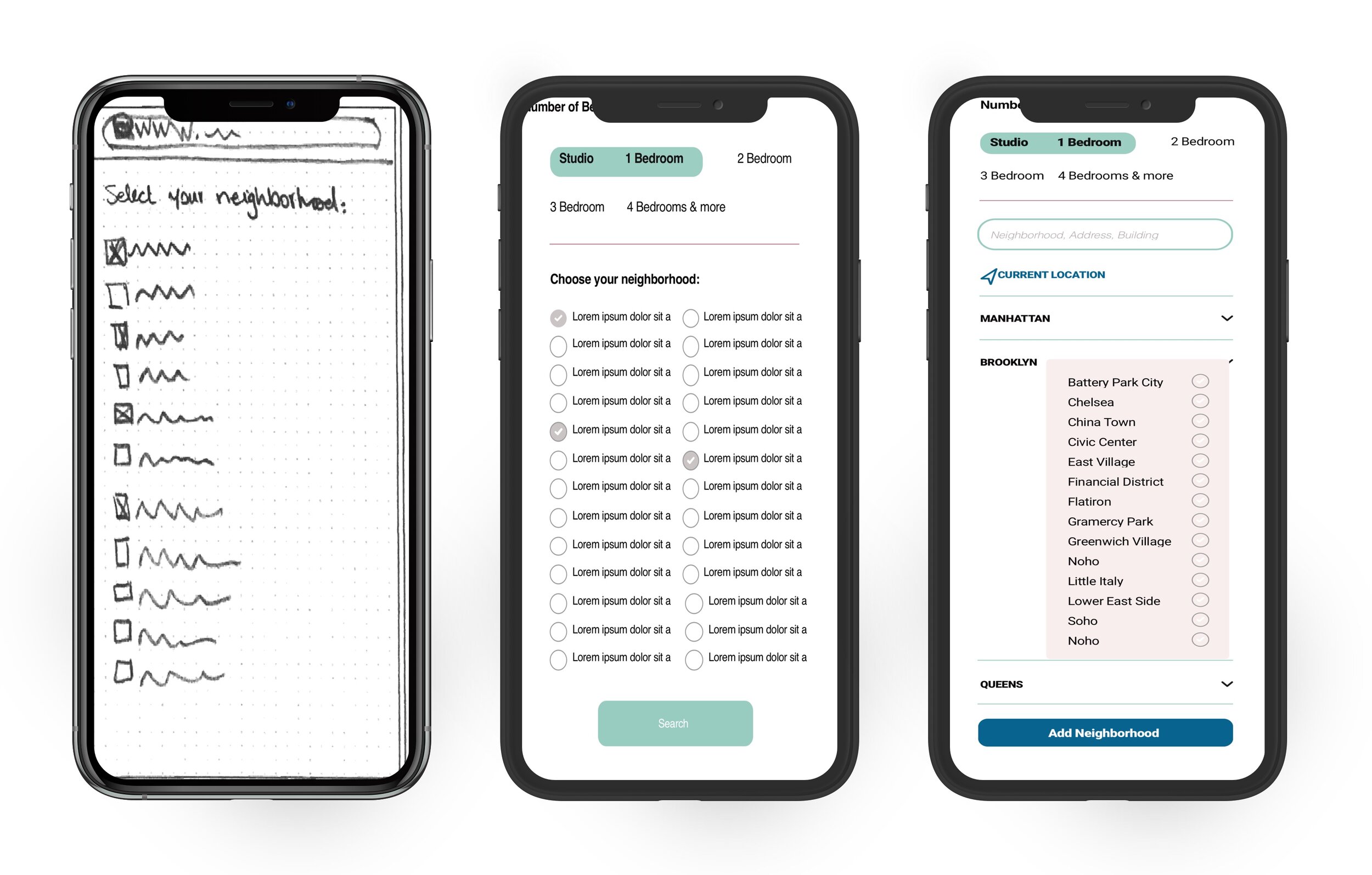
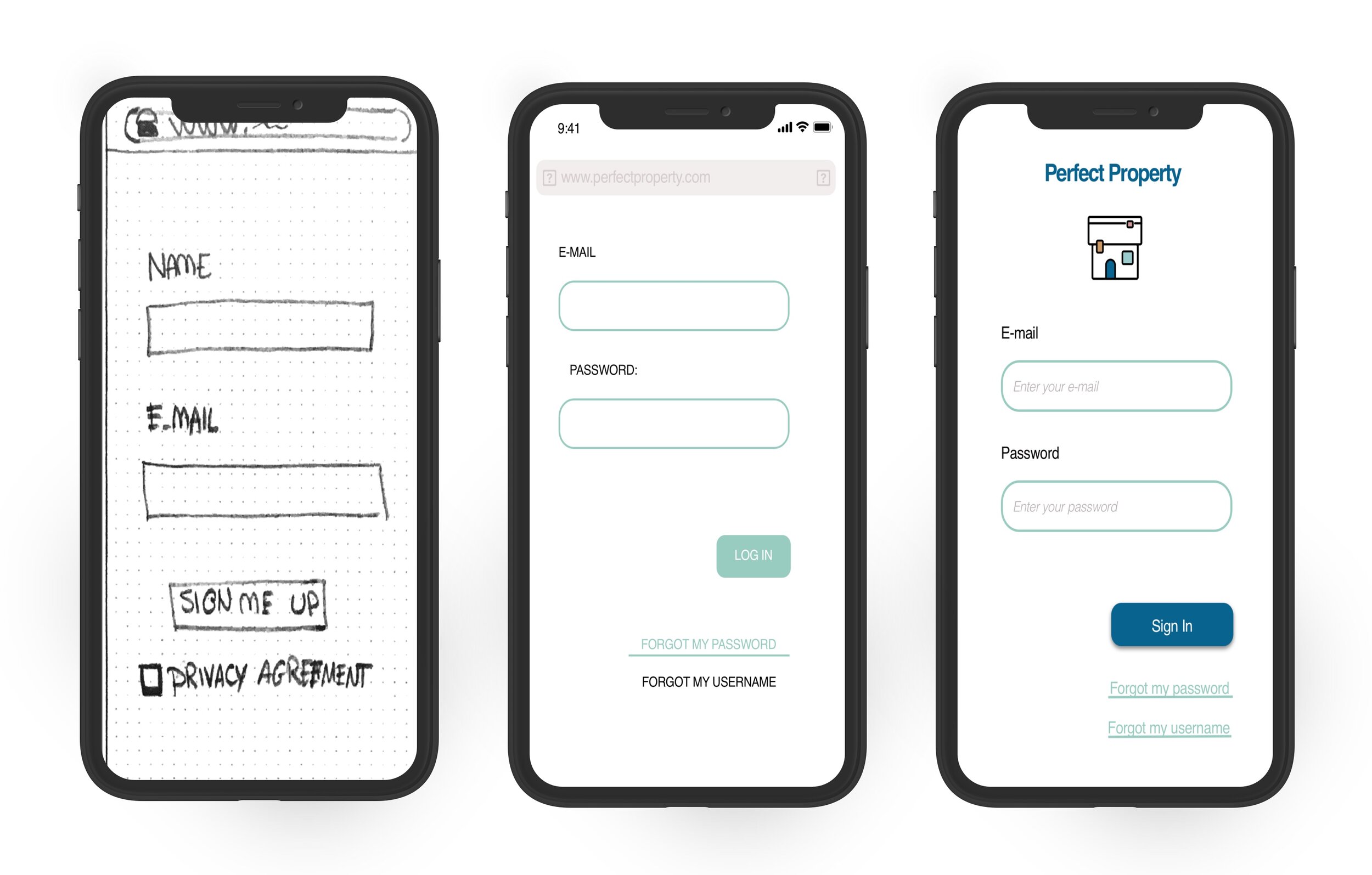
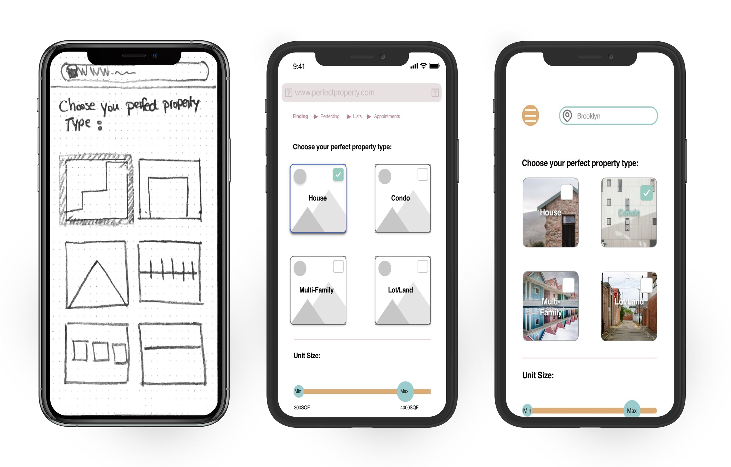
Wireframes
After gathering information from user flows and information architecture sitemap, Low-fidelity wireframes were created to provide a foundation for basic features from one mobile screen to the next mobile screen. We moved onto responsible tablet and desktop layouts next. Mid-fidelity and high-fidelity prototypes were created after. High- fidelity prototypes were edited after several user testings.
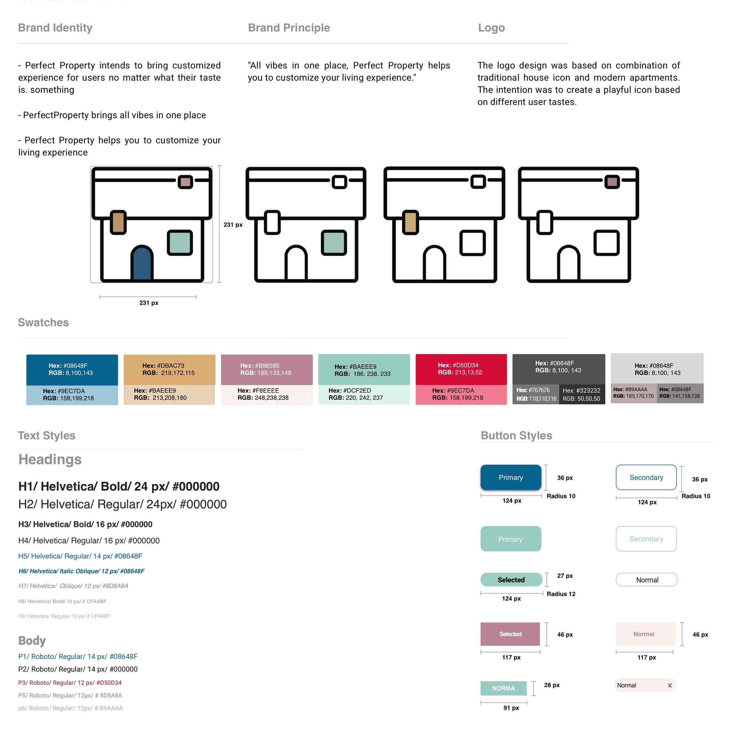
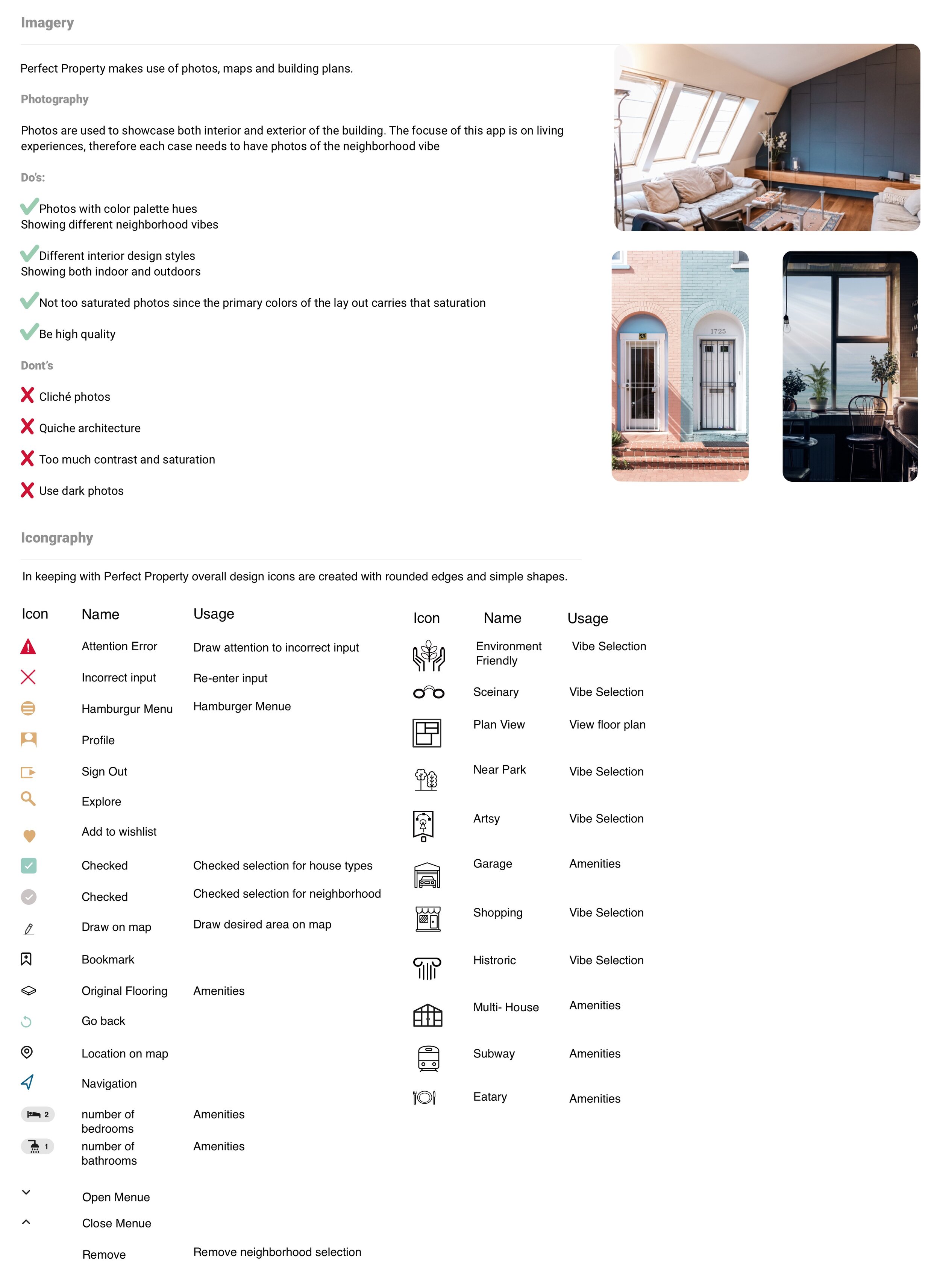
UI Style Guide
There are many components of a style guide that contribute to the overall design. These components include the logo, color palette, iconography, UI elements, typography, and images, and special considerations such as the grid system.
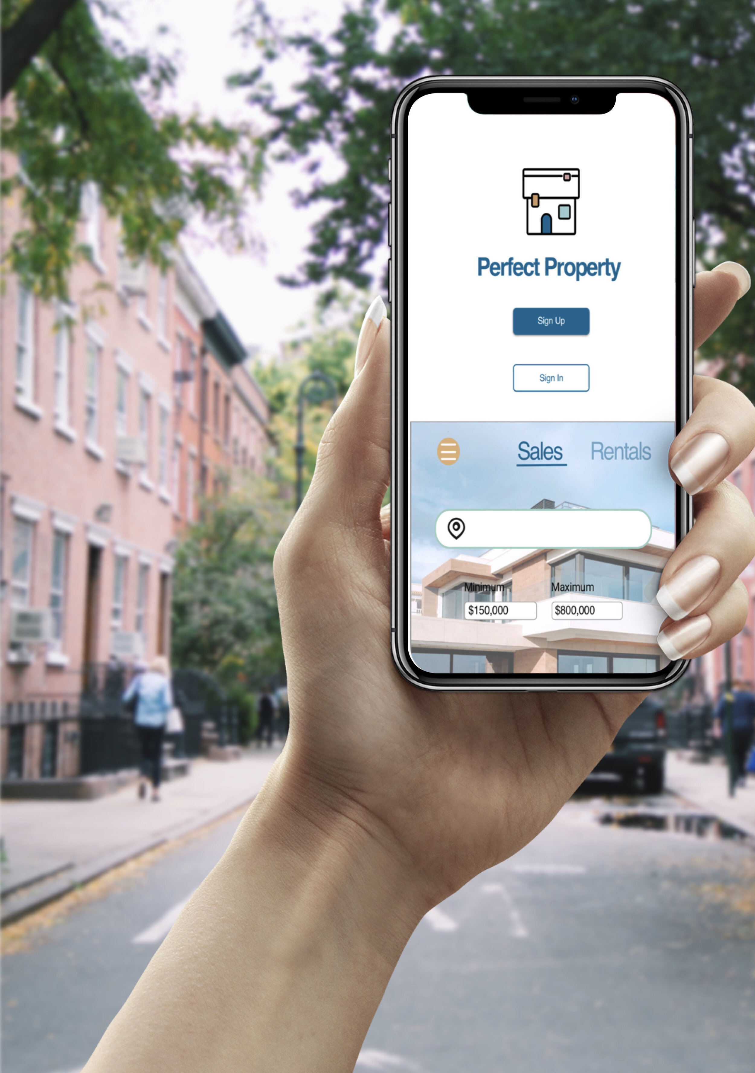
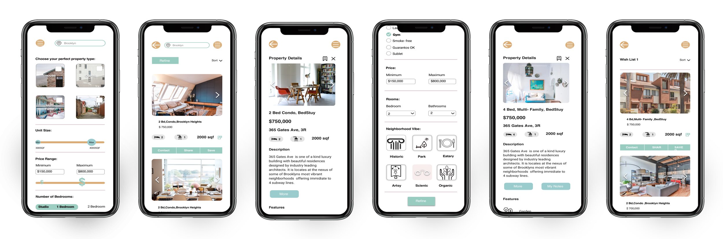
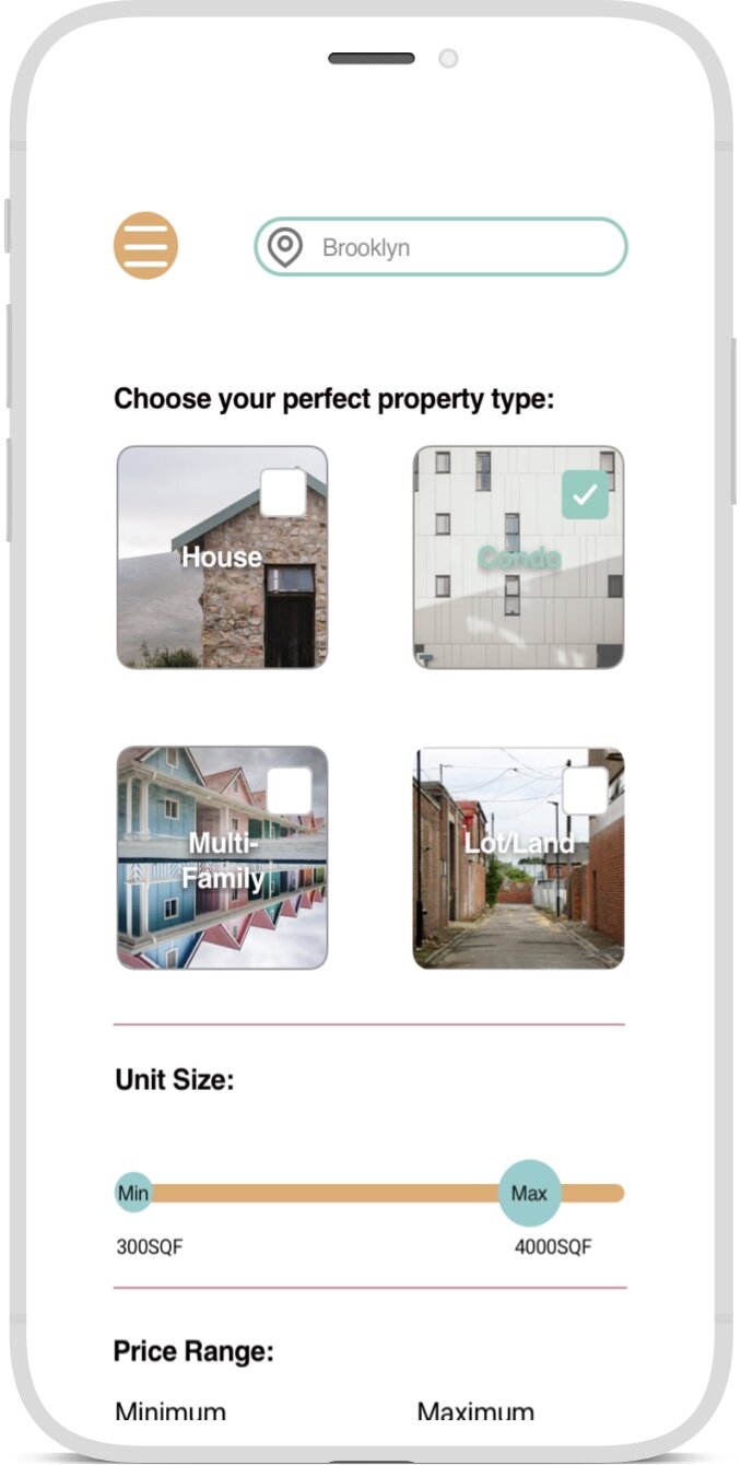
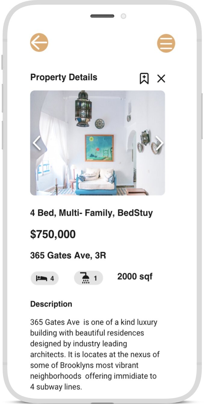
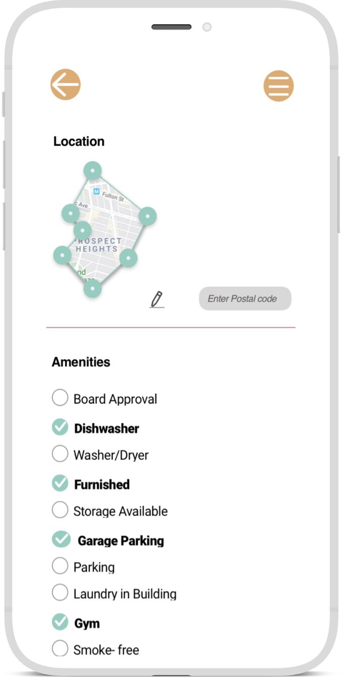
High Fidelity prototypes and mockups
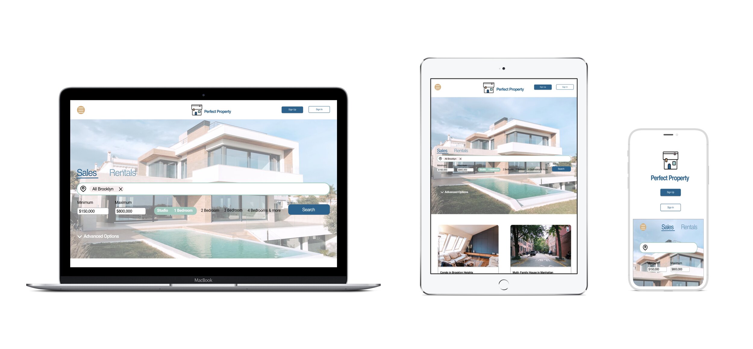
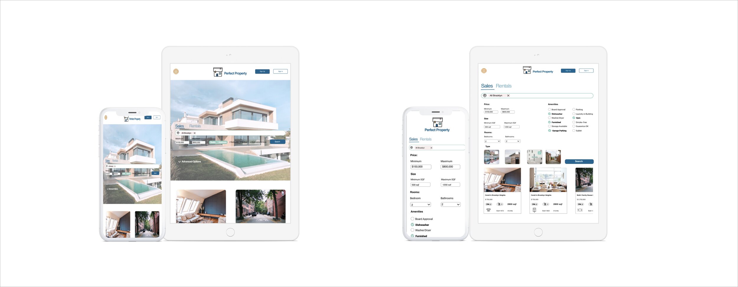
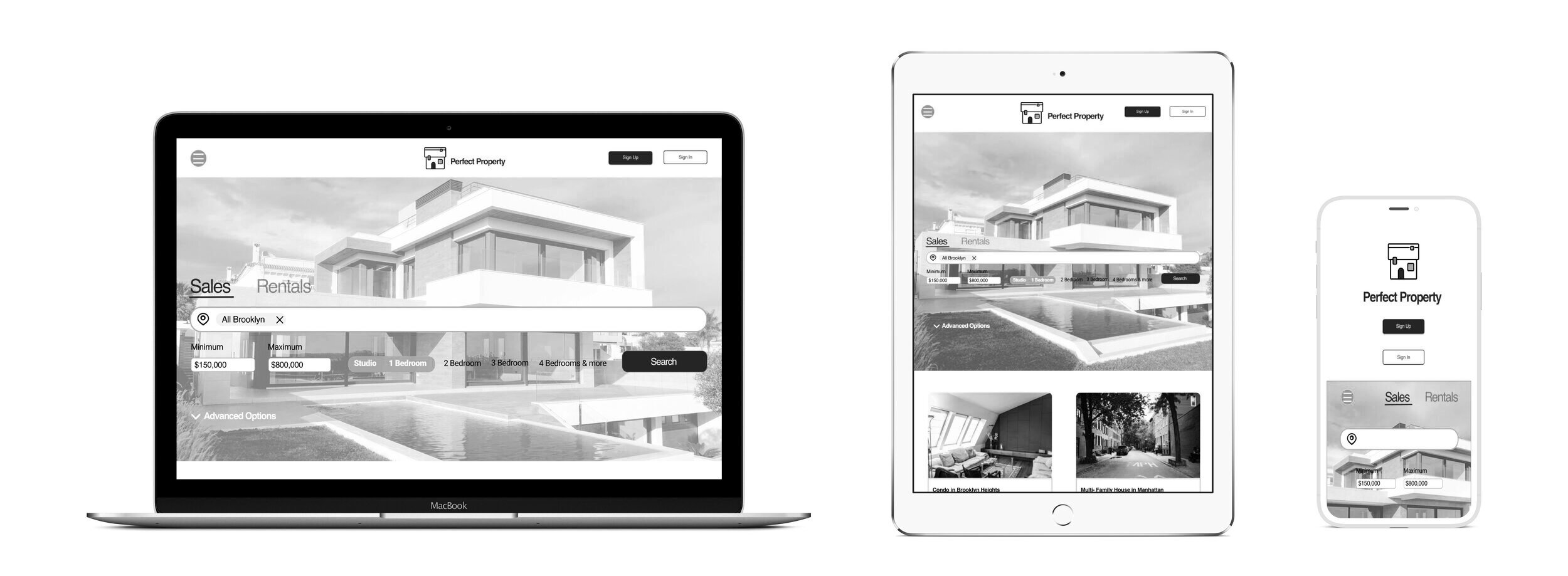
Perfect Properties is developed upon a 12 columns layout at any breakpoints to allow as much flexibility as possible.This case study focused on a mobile-first design, but our product was researched upon 2 additional breakpoints.The main design was developed for any device under a 768 pixels width. The second breakpoint is met with device above 768 pixels width, and the third one for device above 992 pixels width.
Prototype: https://invis.io/87XSK2HN9WS